Display Scaling vs Native Resolution: Which Causes Less Text Blurriness on 27-inch 1440p Monitors
Selecting the most appropriate display settings for a 27-inch 1440p monitor may have a considerable influence on the clarity of the text as well as the general convenience of the viewing experience. When trying to improve readability, users often find themselves in a difficult situation: they must decide whether to use the monitor’s native resolution or to use display scaling. Scaling may cause blurriness, especially in apps that do not fully support high-DPI scaling. Scaling, on the other hand, makes user interface elements larger so that they are easier to see. On the other hand, operating at the native resolution results in text that is clear and distinct, but it may also result in interface elements that are smaller and more difficult to see, particularly on displays that are bigger. It is essential to have a solid understanding of the trade-offs that exist between various techniques in order to guarantee a pleasant user experience and a crisp depiction of the text.
The Influence of Native Resolution on the Clarity of Text
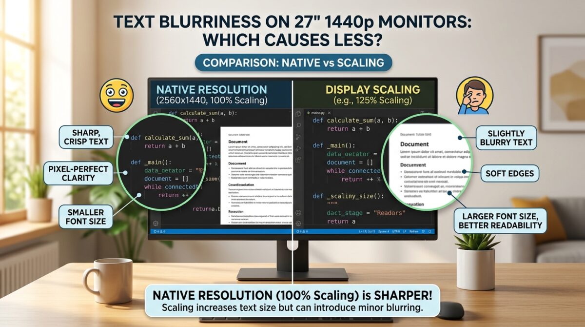
The use of native resolution guarantees that every pixel on the display matches directly to a pixel in the picture that is being generated from the computer. The text and images on a 27-inch 1440p monitor are able to seem crisp and well-defined, with precise edges and accurate color representation, as a result of this. Applications designed to run on high-resolution screens are able to make full use of this clarity, resulting in fonts that are fluid and images that are detailed. However, if you utilize the original resolution without scaling it, the menus, buttons, and text may become smaller. This may cause eye strain if you use the device for an extended period of time, especially if you are seated farther away from the screen.
What Effect Does Display Scaling Have?
The process of display scaling involves increasing the size of items such as text, icons, and interface elements, which makes them easier to see on big displays. It is very helpful for users who like bigger fonts to have the ability to scale without having to change the resolution of their display. In order to modify the size of the user interface, Windows and other contemporary operating systems have scaling choices that are based on percentages, such as 125%, 150%, or 175%. Scaling, despite the fact that it enhances readability, requires the system to interpolate pixels, which might result in a minor blurriness in some apps. This is particularly true for older software or programs that do not completely support high-DPI awareness.
Implications for the Rendering of Fonts and Blurriness
There is a common reason of text blurriness, and that is the way operating systems manage scaling for programs that are not aware of DPI. Some programs are stretched via interpolation rather than being presented at their original pixel dimensions when scaling is performed. This method is used to stretch the programs. It is possible that this may result in characters with somewhat fuzzy edges, inconsistent spacing, or softer edges. On the other hand, apps that are aware of high-DPI or that are optimized for contemporary operating systems keep the text clear even when scaling is performed, which reduces the appearance of blurriness. Users are better equipped to make educated judgments between scaling and native resolution when they have a better understanding of which programs fit into each category.
Optimal Clarity Through the Use of Hybrid Approaches
Through the use of hybrid settings, many users are able to find the optimal balance between readability and crisp clarity. By way of illustration, if you use the display at its natural resolution of 1440p while simultaneously raising the font size inside programs or modifying the zoom settings in the browser, you may get sharp text without resorting to global scaling. Alternately, in order to preserve readability while keeping text clarity, it is possible to apply modest scaling, such as 125%, in conjunction with software that is aware of the DPI. This strategy allows for a more pleasant viewing experience across a variety of applications while also minimizing the limitations of both previously mentioned ways.
Implications for the Configuration of Multiple Monitors
The choice between scaling and native resolution may have an impact on the productivity and uniformity of text for users who have many displays working simultaneously. When you move windows from one screen to another, jarring transitions might occur because of mismatched scaling between monitors, which can cause text and interface elements to appear in different sizes. Maintaining the original resolution across all displays helps to maintain visual continuity, and careful scaling management helps to guarantee that all monitors continue to be legible without adding any obvious blurriness. When it comes to productivity settings or creative work, where accuracy in text rendering and interface layout is of the utmost importance, this aspect is especially vital.
Optimization of the Operating System and Additional Software
Modern operating systems have improved their support for high-DPI, which has the effect of lessening the negative impact that scaling has on the clarity of text. Users are able to apply various scaling settings to separate screens thanks to features such as per-monitor DPI scaling. This allows users to maintain clear text on a 27-inch 1440p monitor while also supporting monitors with a higher or lower resolution. In addition, software developers are progressively optimizing apps to handle scaling in an appropriate manner, so decreasing blurriness and assuring consistent font rendering results. Regardless of the scaling mechanism that is used, maintaining the most recent versions of both the operating system and programs guarantees the highest possible level of text clarity.
In-Practice Recommendations for Monitors with a 27-inch 1440p Display
When it comes to a 27-inch 1440p monitor, the native resolution often offers the finest text, especially in contemporary programs that are aware of high DPI. Users who feel that the elements of the interface are too tiny may enhance readability by increasing the text size or applying modest display scaling inside the apps themselves. This will not result in substantial blurriness. In order to maintain the text’s crispness, it is important to avoid using excessive scaling percentages. Additionally, using software-level modifications offers extra versatility. Users are able to obtain optimum text clarity and comfortable reading for prolonged usage by striking a balance between the native resolution and tailored scaling.
Increasing the level of visual comfort and sharpness
Understanding the relationship between resolution, scaling, and software optimization is ultimately necessary in order to reduce the amount of text blurriness that occurs on a 27-inch high-definition display. When correctly controlled, display scaling may improve readability, while native resolution can provide the highest possible level of clarity. Users are able to experience clear text, comfortable interface sizing, and consistent graphics across a variety of software by combining apps that are aware of high DPI with minimal scaling and font modifications. This method offers both efficiency and comfort, and it provides a visually exact experience on big panels with a high resolution.